man first of all don't post previews as "here are my wips" we have no idea what dragons go with what accents and then we've got to FIND a dragon to wear the accent and that's a lot of work to put on people who are trying to help you
just give us a link to the image on the PSD dragon template nonny
Oh man, oh jeez I'm sorry! I thought it'd be easier because they were all right there, but noted for future critiques!
The last is a handful of WIPs. The bottom three were going to be contest entries. (And the deliberately shitty art on the guardian was just to get my plans down.)
okay, the thing I think when I look at these is, 'what's the goal?' what I mean is that they look kind of...aimless? I don't get a strong sense that you, as the artist, can explain WHY you've made all of the artistic choices that went into these.
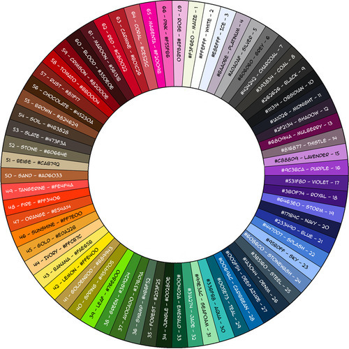
like, let's just take the first one: you've got a mane-and-fur recolor that's seafoam in the highlights, blending into swamp in the midtones and shadows. there's also a dark green, sort of forest-y tinge on the wingtips. So: why those colors? what is the dragon you're imagining that this accent would improve? swamp/forest belong to a darker, more sombre, more lush palette, and go especially well with greys, stones, and golds: seafoam goes with the pastels, or with bright shades like magenta and tangerine. it is very VERY uncommon that you'll see green tones from both of those palettes combined intentionally. they just don't flatter each other. in any accent, or any piece of art really, it's important to choose a color palette that is harmonious for the whole piece. any attractive accent is probably going to be made up of about 3-5 colors with shades inbetween that all go really nicely together! and I can guarantee you that those accent artists thought about the palette ahead of time, and probably had it set up with little swatches so they could grab the 'pure' color as often as they needed to.
but maybe even more importantly: what are you going for with this accent in an artistic sense? okay, so you've put some green on the dragon. why? are you going for something nature-y? a diseased look? maybe something nautical? or were you thinking of something more like oxidized copper? other than 'some green is now on this dragon' I don't really GET anything from this, you know? if you gave it a slick, scummy texture and maybe draped some seaweed around the neck, you could make this the start to a cool-gross 'underwater leviathan' accent. if you made it look more like rusted copper, maybe gave it some bright spots and some engraved details and edges to make it look like weathered ornamentation, that could be cool too, and would be a totally different accent. but it's not enough to just dunk some color on the dragon and then back away. you need some kind of artistic vision, if you want people to find the accent useful and appealing. that's not to say it can't be abstract, but even abstract accents will EVOKE something if they're good.
tl;dr: deliberate artistic choices are important, from accent concept to choice of colors.
Yeah, I'm still here. I'm just really shit at responding promptly - like now.
And you critique is actually one of the most helpful I've received, thank you! I'm not gonna lie, I had a rough theme in my head, not just for the imp one but most of them, and just kinda went along with it within my skill level. I was actually going for a somber, nature-y theme, but when I tried to expand upon it (adding vines, leaves, etc.), it went beyond what I would be capable to do. Which is why I'm focusing on more abstract, decorative? accents, because just colors and patters is closer to what I can do right now.
And that's also kind of another issue, in that I have unrealistic expectations for how long developing art skills takes. This is basic beginner stuff, and I know logically, that it's not supposed to be good and sale-worthy right now because I still need more practice, but working on something but not having a finished product just seems wrong? and I need to get over that.
tl;dr: I need to art more, then come back and try again.
![[personal profile]](https://www.dreamwidth.org/img/silk/identity/user.png) anonrisingcomod) wrote in
anonrisingcomod) wrote in ![[community profile]](https://www.dreamwidth.org/img/silk/identity/community.png) anonrising2015-06-29 12:57 pm
anonrising2015-06-29 12:57 pm
Re: OP
(Anonymous) 2015-07-01 09:13 am (UTC)(link)just give us a link to the image on the PSD dragon template nonny
Re: OP
(Anonymous) 2015-07-01 07:35 pm (UTC)(link)The last is a handful of WIPs. The bottom three were going to be contest entries. (And the deliberately shitty art on the guardian was just to get my plans down.)
ayrt
(Anonymous) 2015-07-01 08:16 pm (UTC)(link)okay, the thing I think when I look at these is, 'what's the goal?' what I mean is that they look kind of...aimless? I don't get a strong sense that you, as the artist, can explain WHY you've made all of the artistic choices that went into these.
like, let's just take the first one: you've got a mane-and-fur recolor that's seafoam in the highlights, blending into swamp in the midtones and shadows. there's also a dark green, sort of forest-y tinge on the wingtips.
So: why those colors? what is the dragon you're imagining that this accent would improve? swamp/forest belong to a darker, more sombre, more lush palette, and go especially well with greys, stones, and golds: seafoam goes with the pastels, or with bright shades like magenta and tangerine. it is very VERY uncommon that you'll see green tones from both of those palettes combined intentionally. they just don't flatter each other.
in any accent, or any piece of art really, it's important to choose a color palette that is harmonious for the whole piece. any attractive accent is probably going to be made up of about 3-5 colors with shades inbetween that all go really nicely together! and I can guarantee you that those accent artists thought about the palette ahead of time, and probably had it set up with little swatches so they could grab the 'pure' color as often as they needed to.
but maybe even more importantly: what are you going for with this accent in an artistic sense? okay, so you've put some green on the dragon. why? are you going for something nature-y? a diseased look? maybe something nautical? or were you thinking of something more like oxidized copper? other than 'some green is now on this dragon' I don't really GET anything from this, you know? if you gave it a slick, scummy texture and maybe draped some seaweed around the neck, you could make this the start to a cool-gross 'underwater leviathan' accent. if you made it look more like rusted copper, maybe gave it some bright spots and some engraved details and edges to make it look like weathered ornamentation, that could be cool too, and would be a totally different accent. but it's not enough to just dunk some color on the dragon and then back away. you need some kind of artistic vision, if you want people to find the accent useful and appealing. that's not to say it can't be abstract, but even abstract accents will EVOKE something if they're good.
tl;dr: deliberate artistic choices are important, from accent concept to choice of colors.
I hope this was helpful!
Re: ayrt
(Anonymous) 2015-07-03 12:02 am (UTC)(link)And you critique is actually one of the most helpful I've received, thank you! I'm not gonna lie, I had a rough theme in my head, not just for the imp one but most of them, and just kinda went along with it within my skill level. I was actually going for a somber, nature-y theme, but when I tried to expand upon it (adding vines, leaves, etc.), it went beyond what I would be capable to do. Which is why I'm focusing on more abstract, decorative? accents, because just colors and patters is closer to what I can do right now.
And that's also kind of another issue, in that I have unrealistic expectations for how long developing art skills takes. This is basic beginner stuff, and I know logically, that it's not supposed to be good and sale-worthy right now because I still need more practice, but working on something but not having a finished product just seems wrong? and I need to get over that.
tl;dr: I need to art more, then come back and try again.
Thank you so much for the detailed critique.